The Mark
One shape, three meanings: a nail, a 도장 (dojang) seal, and her signature. The Nail Seal borrows the red ink seal used to sign documents and artwork in Korea, shaped as an almond nail with an authentic carved “엘” glyph.
Logo Versions
All official logo lockups from the brand kit. Text is outlined vector geometry; no live font dependency is required for the wordmark.
Used in website header, email signature, and stationery.
Used for packaging boxes, tote bags, posters, and centered layouts.
On Charcoal Slate, the seal switches to Milk Rose (#F2C4C4) with Porcelain lettering.

Only used when the seal is already nearby (e.g. back of a card or footer).
Clear Space & Minimum Size
Keep a free margin of half the seal’s width (½ W) on every side. Below 28 px tall, switch to the small-size geometry (`nail-seal-small-*`) where the gloss line is removed and the “엘” is enlarged for legibility.
Colour Palette
The core palette balances a calm porcelain canvas with deep charcoal typography, muted stone borders, and sensory Korean rose tones.
Allowed Colourways
The four strict colour combinations for the brand mark. Do not create new colour combinations.
Typography System
Three families, rigorously applied. Pretendard unifies Latin and Hangul body text, replacing both Montserrat and monospace styles.
Secondary Marks
Secondary marks support the primary Nail Seal in specific contexts. The EH signature provides a personal sign-off, while the square stamp fits square formats.
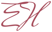
Used for thank-you cards, aftercare notes, and the end of videos. Never replaces the Nail Seal.

For square spaces where the tall nail does not fit: photobooth frames, box corners, and round stickers.
Please Don’t
Strict rules to protect the integrity of the nail seal and wordmark.
Voice & Copy
Short, sensory, and warm. Keep “atelier” as the only prestige word. Remove age and prodigy claims; use first name “Eliya” only.